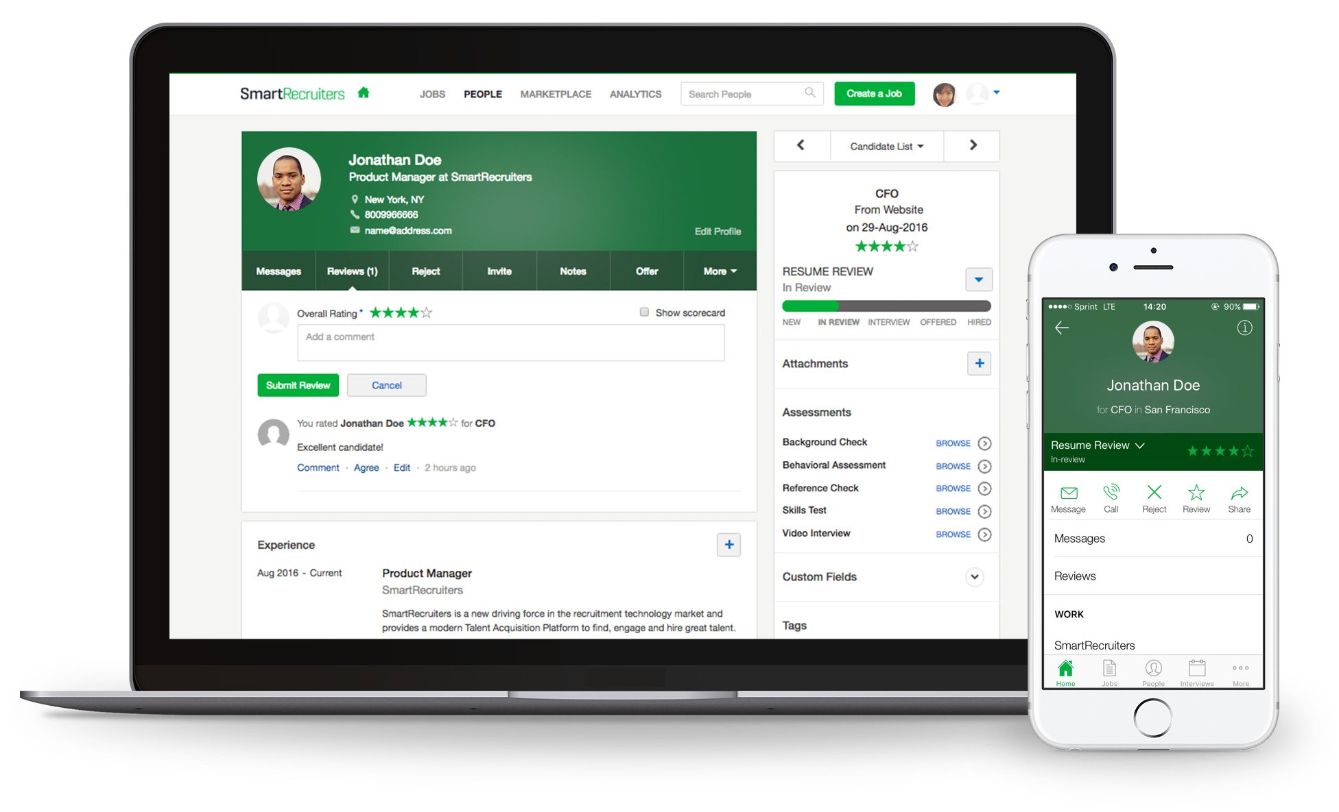
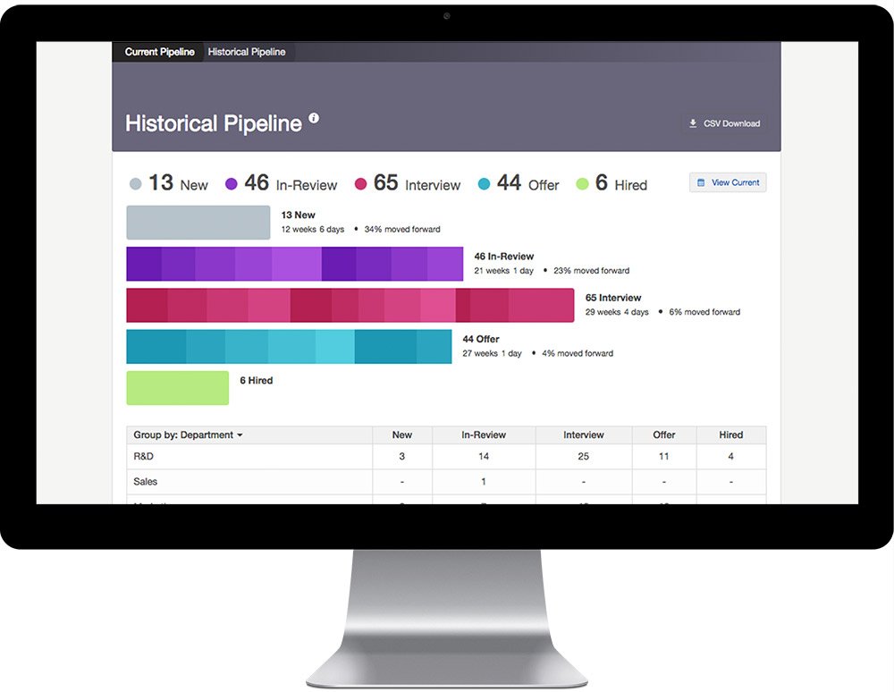
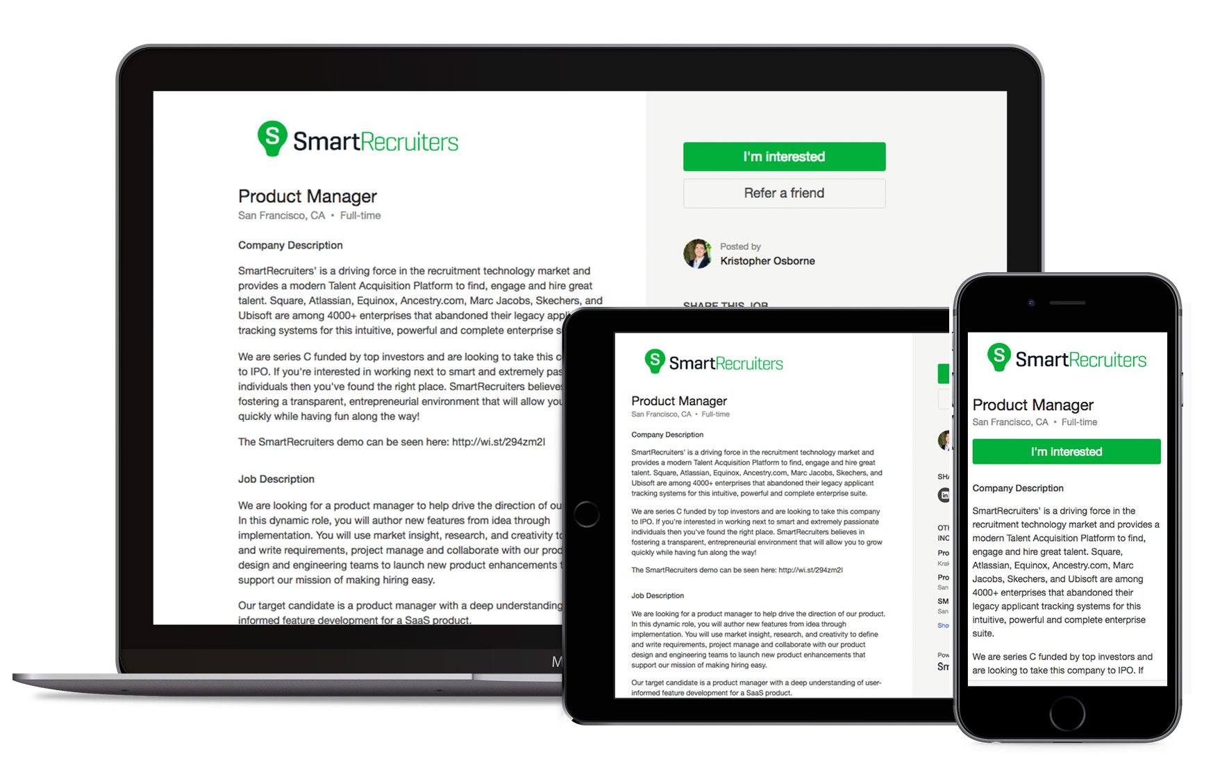
SmartRecruiters’ Talent Acquisition Suite is used by high-performance organizations for making the best hires. It has full functionality for recruitment marketing and collaborative hiring built on a modern cloud platform with an open marketplace for 3rd party recruitment services. Unlike the first generation applicant tracking systems it replaces, SmartRecruiters provides an amazing candidate experience, hiring managers actually want to use the product, and recruiters love us because we make their jobs easier. Companies like Visa, Skechers, LinkedIn, Equinox, and McDonalds use SmartRecruiters to make recruiting a competitive advantage.
SmartRecruiters
Images
Check Software Images
Customer Reviews
SmartRecruiters Reviews
Iulian P.
Advanced user of SmartRecruitersWhat do you like best?
Centralised candidate assessment and communication tools, native and friendly candidate and HR user experience throughout the platform, simple yet effective team collaboration features, multi-role assignment and facilitated employee access in the platform.
Emails sent to candidates are highly customisable and more personal, as the HR user is shown as the sender of the email (instead of a noreply address). Assessments are consolidated in the platform and can be deployed quickly, and the pricing is at negotiated lower rates.
When advertising on LinkedIn, application rates increase due to the Easy apply feature that is automatically added based on SmartRecruiters integrations.
What do you dislike?
Some features aren't modifiable by design (e.g. Deletion of inactive users), only rejection emails can be scheduled beforehand, resume parsing is faulting at times, the provided job portal is too simplistic and doesn't enable further customisation.
Job opening distribution to external recruitment marketing platforms could be improved since propagation times tend to be high.
What problems are you solving with the product? What benefits have you realized?
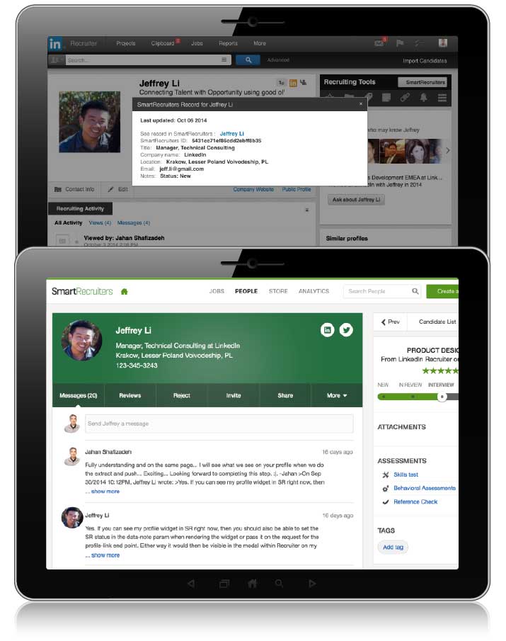
Streamlined and united candidate tracking is now possible, together with a more efficient way of integrating the HR team's comments and notes. Candidate engagement is primary for us, so an ATS easy to use and straightforward with the applications helps us reduce information collection times in comparison to SmartRecruiters competitors with lengthy applications and design-lacking interfaces. The recruitment process has a hub format where all elements from assessment to approval and offer management are managed inside the platforms.


