What do you like best?
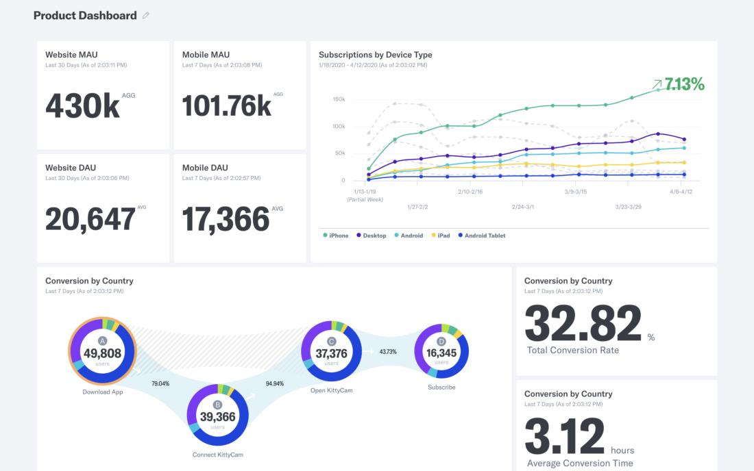
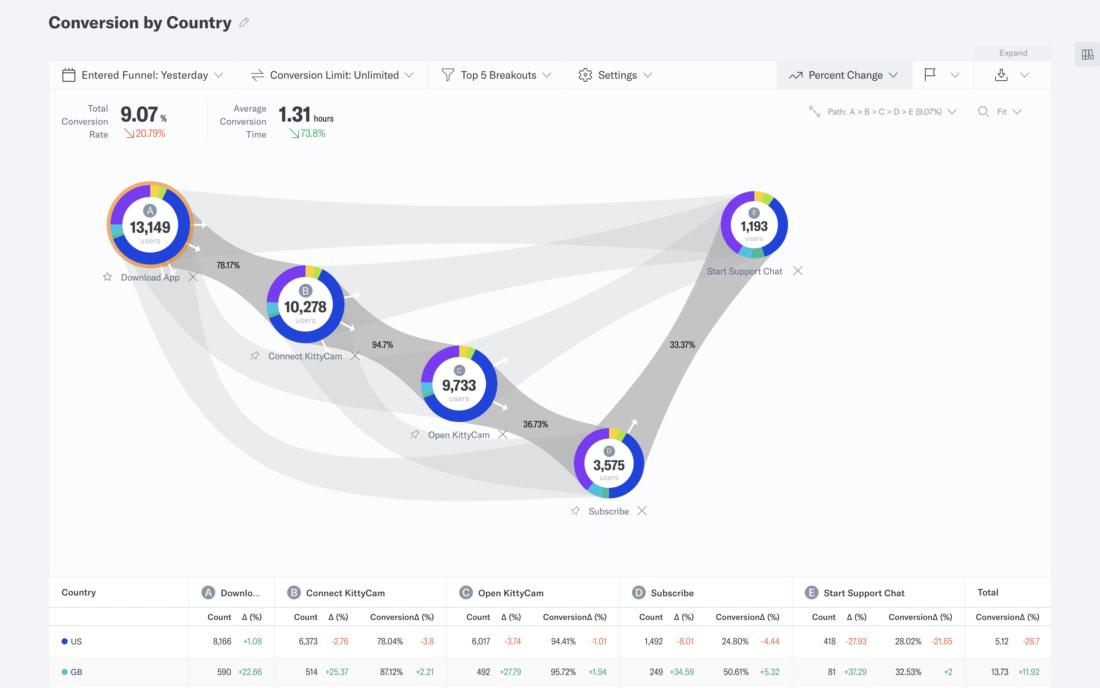
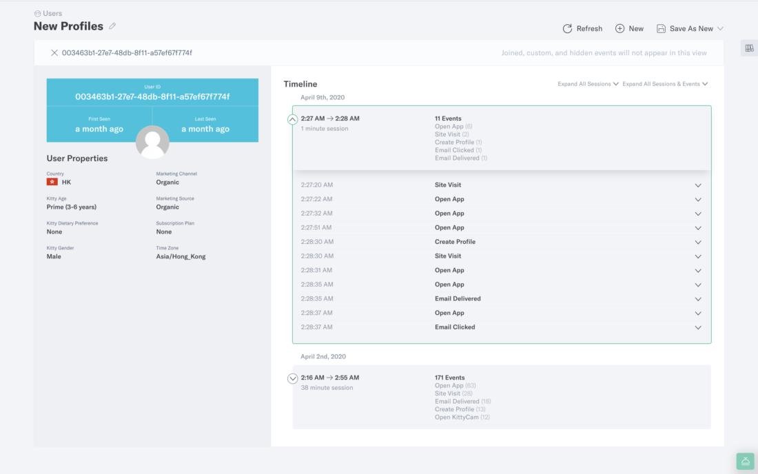
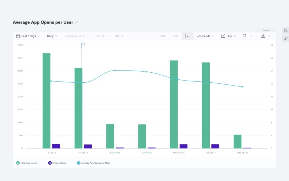
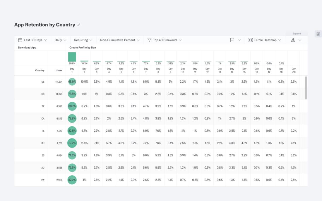
I think the dashboards and the conversion graphs are the best part of the toll. But apply the filters are hard and sometimes are necessary understand programming language to use all resources. I'm a User Experience Desinger and for me, it's important the view of full costumer jouney. Indicative hepls me to search and study the gaps in the journey and correct then. The best part is that we can create several funnels with specific points of interest from different areas of the company, these funnels are complementary to each other and the information can be discussed in a team.
What do you dislike?
On some screens the numbers of the dashboards are too small, and it's hard to see them. I think that increase the size of the font is the best way to make the site more accessible. Some features, such as creating a funnel, are complex for those who are not used to using analytics softwares. The platform also brings a lot of information at once, making it difficult to read, and the interface may seem at first unfriendly to anyone who is adapted to Google Analytics.
Recommendations to others considering the product:
Indicative is a good tool for startups and cheaper than others, without neglecting the quality and reliability of data. in addition to facilitating the work with reports and dashboards of user's journey. Indicative can also help various areas of the company to integrate and share their information, since the dashboards are detailed and very complete.
What problems are you solving with the product? What benefits have you realized?
Now we can see the real conversion rate, because in our Google Analitics the rate is extracted in a sample. We an extract the data and we can make better reports. I realized that our reports are more reliable and complete, being used by many areas of the company, such as CRO, Media Performance and DevOps.


