Why do 25 of the Fortune 100 and 45,000 products (including the G2 team) use Amplitude?
Amplitude is the Digital Optimization System used by the most valuable brands and disruptive teams to understand and personalize their digital products, and optimize the business value of product innovation.
Whether you want to understand how users are navigating through your application, which features engage them the most, or how to improve long-term user retention, Amplitude helps you answer questions critical to your digital product strategy.
It’s also the only analytics solution built to meet the needs of modern product and growth teams, with real-time analytics, cross-platform tracking, powerful behavioral analytics, and Enterprise-level security and customer support.
It’s the system used by the digital disruptors – customers that have built the most loved and valued digital products in the world – like Paypal, Twitter, Peloton, Doordash, Atlassian, Shopify – and successfully transformed their business to digital – like Ford, Walmart, AB InBev, Disney, Burger King, Capital One, and IBM.
You can learn more about why G2 chooses Amplitude at https://amplitude.com/case-studies/g2
You can get started with a free account today at https://amplitude.com
YaДџmur Y.
Advanced user of Amplitude Analytics
★★★★★
Amplitude is easy to use data tracking platform.
What do you like best?
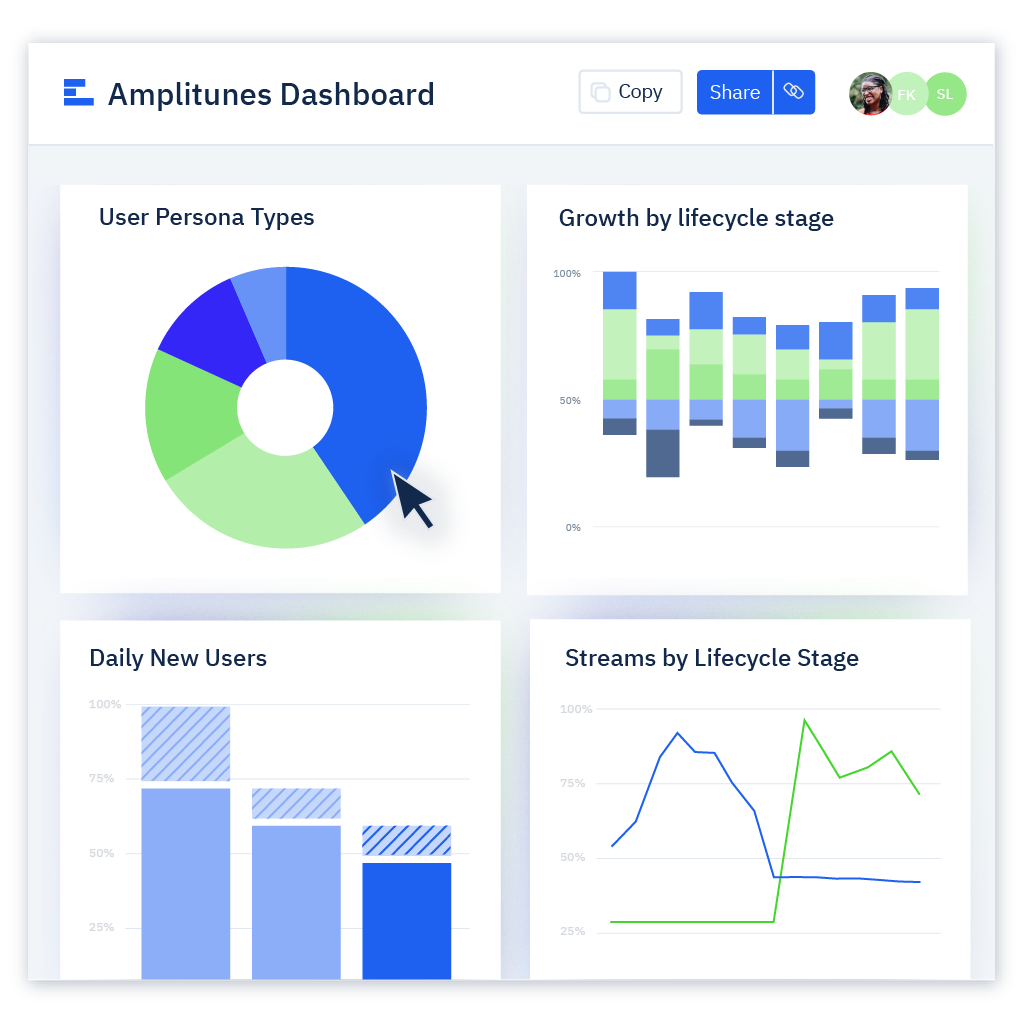
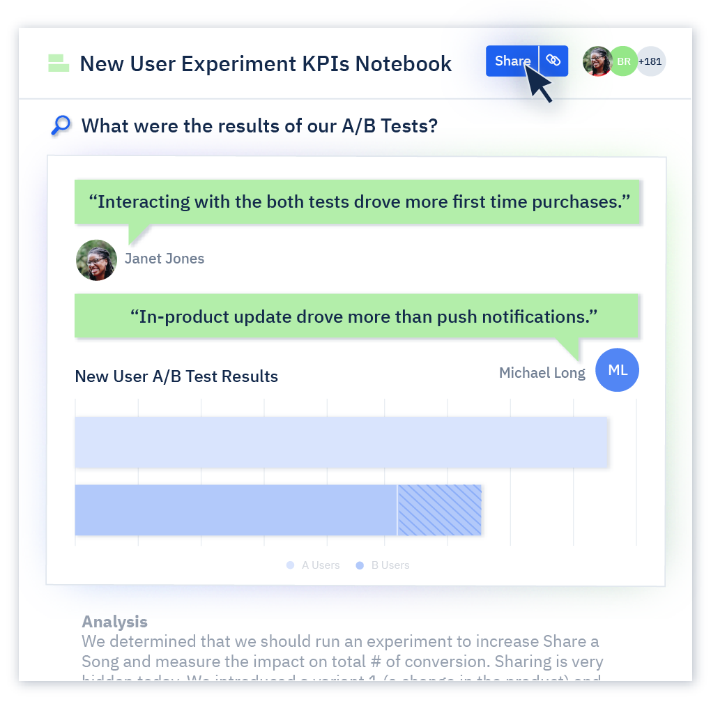
I can quickly generate charts and share the links with my teammates. n "Active Engaged User" chart which is a critical KPI for our app; we use this chart on the Content, Marketing, Growth team's main dashboards.
What do you dislike?
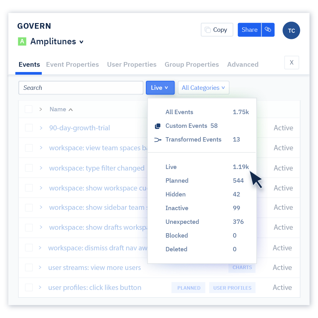
The data source is only mobile-based. I can't add my data from my SQL base. Also as I am a Jr, sometimes the UI is hard to understand all features.
Recommendations to others considering the product:
UI is sometimes so complicated. If there is an info button for features, it will be helpful for Juniors like me :) Amplitude has great documentation for its features, but it does not easy to find them; maybe a "?" icon will simplify accessing them. Tagging special events is also complicated. If there will be a calendar feature and label the day and events, it will be amazing. We generate different content for engaged our users and could not see it easily on dashboards. Besides, I prefer adding headings on my dashboards different sections like "bla bla bla features reports" "user reports" etc. We are using main dashboards for every team, which are opened every day on their one browser tab and are checked regularly; it is complicated to find the correct section mentioned at the meetings. I mean, I want to make dashboard UI like Google Colab or Jupyter Notebook.
What problems are you solving with the product? What benefits have you realized?
Dynamic dashboards are handy. I can add charts with an + icon and customize them for different seasons' needs. Also, you can use any chart on every dashboard. For example, we made an "Active Engaged User" chart which is a critical KPI for our app; we use this chart on the Content, Marketing, Growth team's main dashboards.
Review source: G2.com

