UI makes it super easy to use
What do you like best?
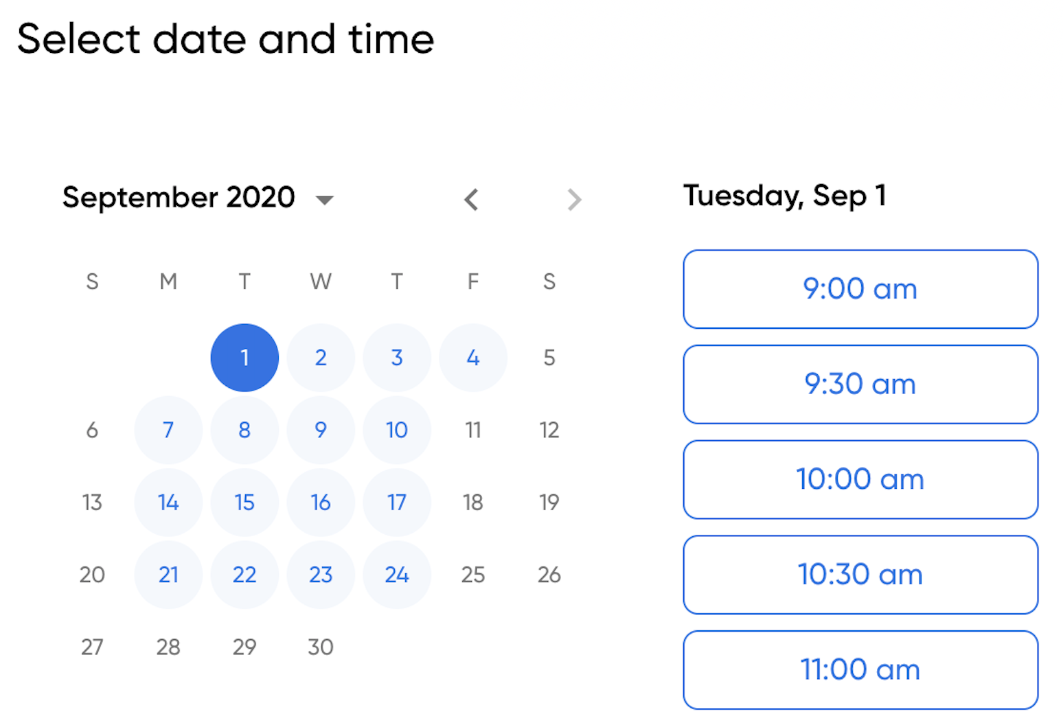
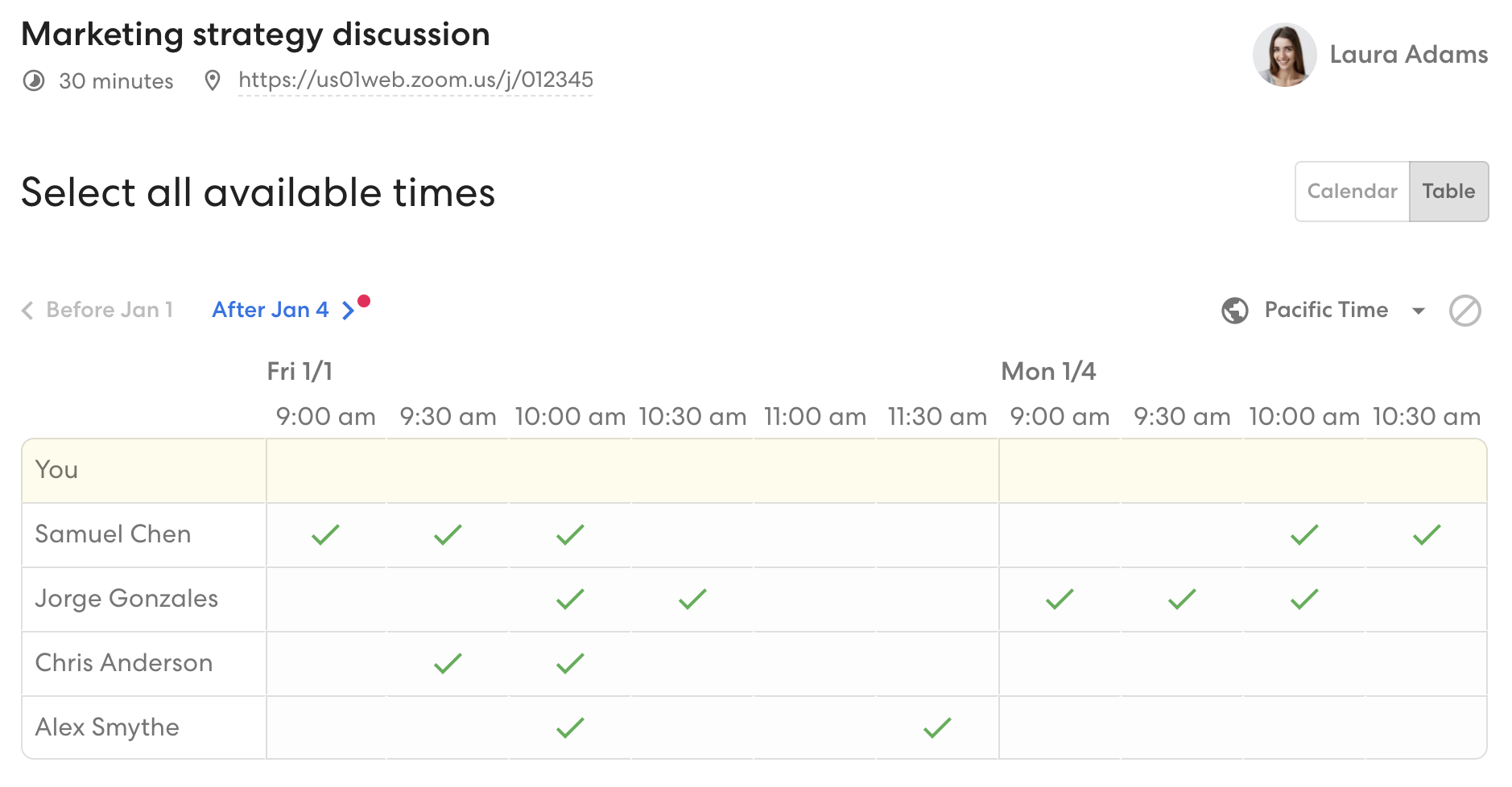
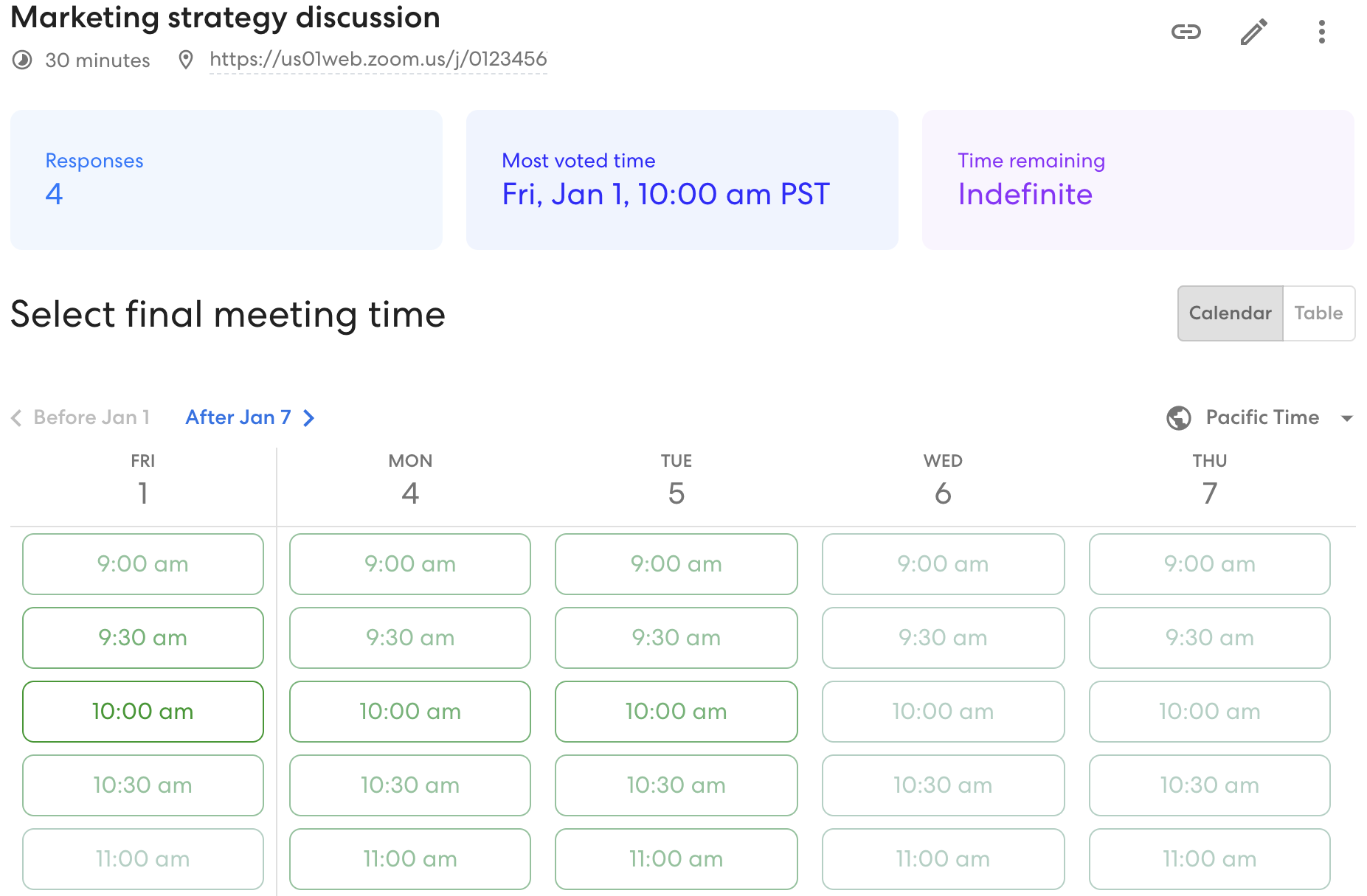
My favorite thing about zcal is the UI. I used to be an avid Doodle user, but after having to set up so many Doodle polls where I had to click each 30minute time slot, and users had to scroll and scroll, I knew there had to be a better alternative. A friend told me to try zcal, so I checked it out. As the scheduler, to set up the time slots is super easy, you just click and drag! And as the attendee, to select their availability, they're able to click and drag to select their availability. It's much easier to use than Doodle. And the best part is, no ads! Very clean UI.
What do you dislike?
I think I was so used to Doodle that it took me a while to learn zcal. Not that zcal isn't user friendly, it is! But with any new application, learning takes time and maybe a few mistakes. So far there isn't anything I dislike.
What problems are you solving with the product? What benefits have you realized?
Scheduling meetings with people outside of my company. Have saved lots of time and back and forth emails with folks.


