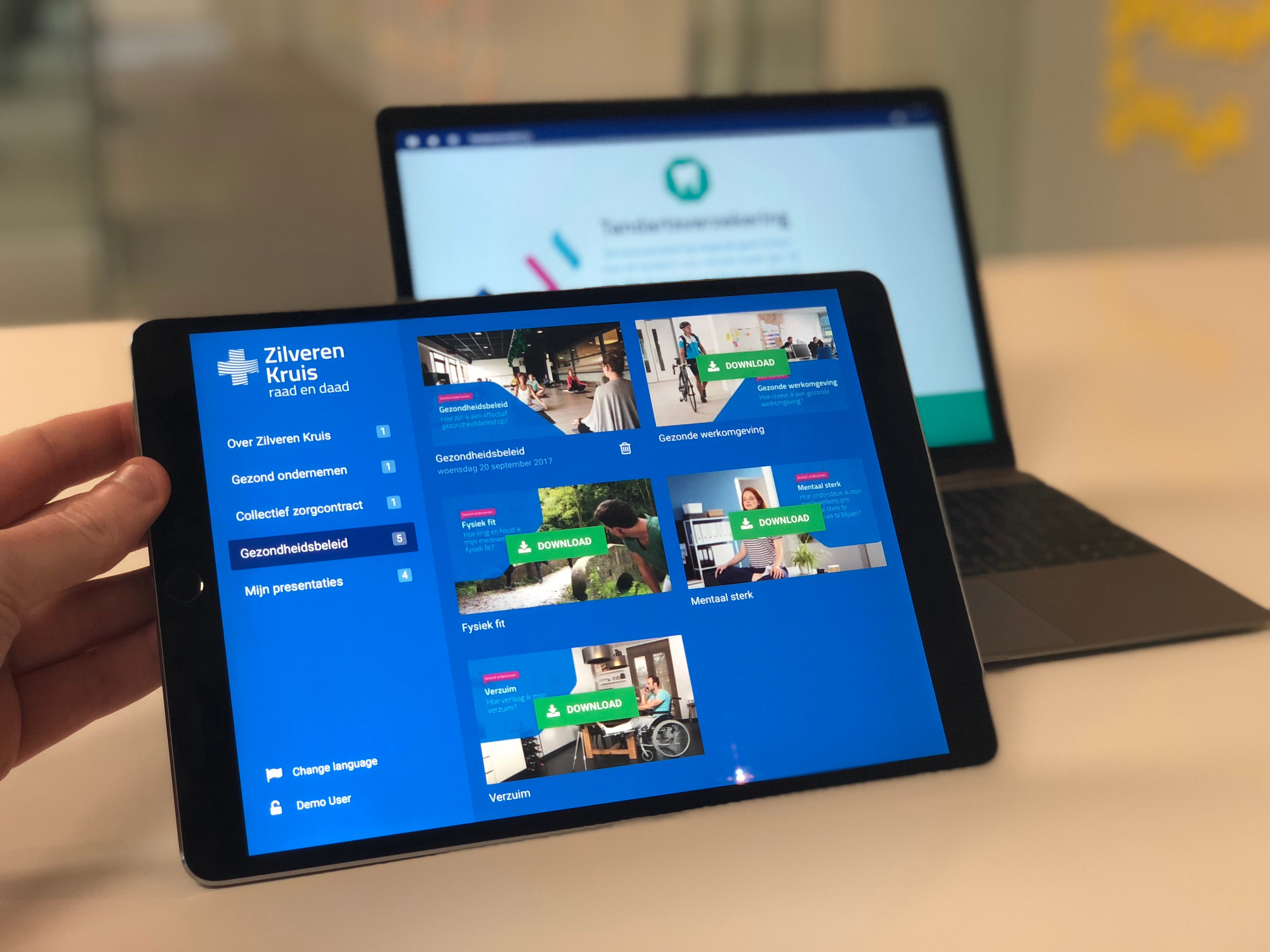
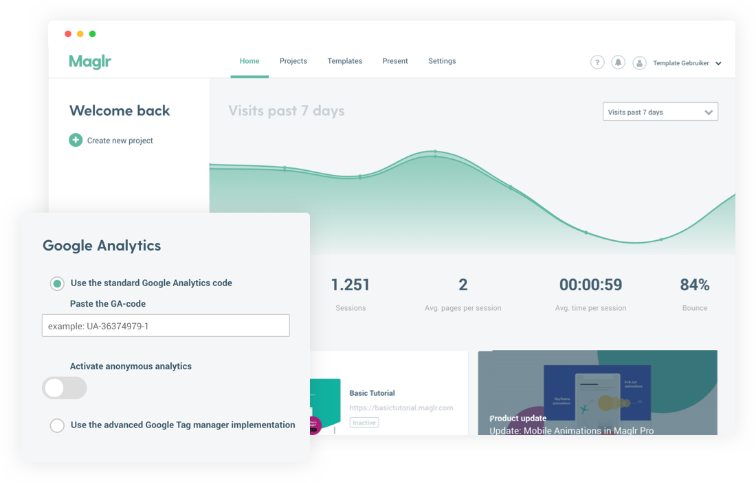
Maglr is the content creation platform that empowers companies to create visual and interactive content for sales & marketing communications. Join their mission by replacing static content with better content experiences.
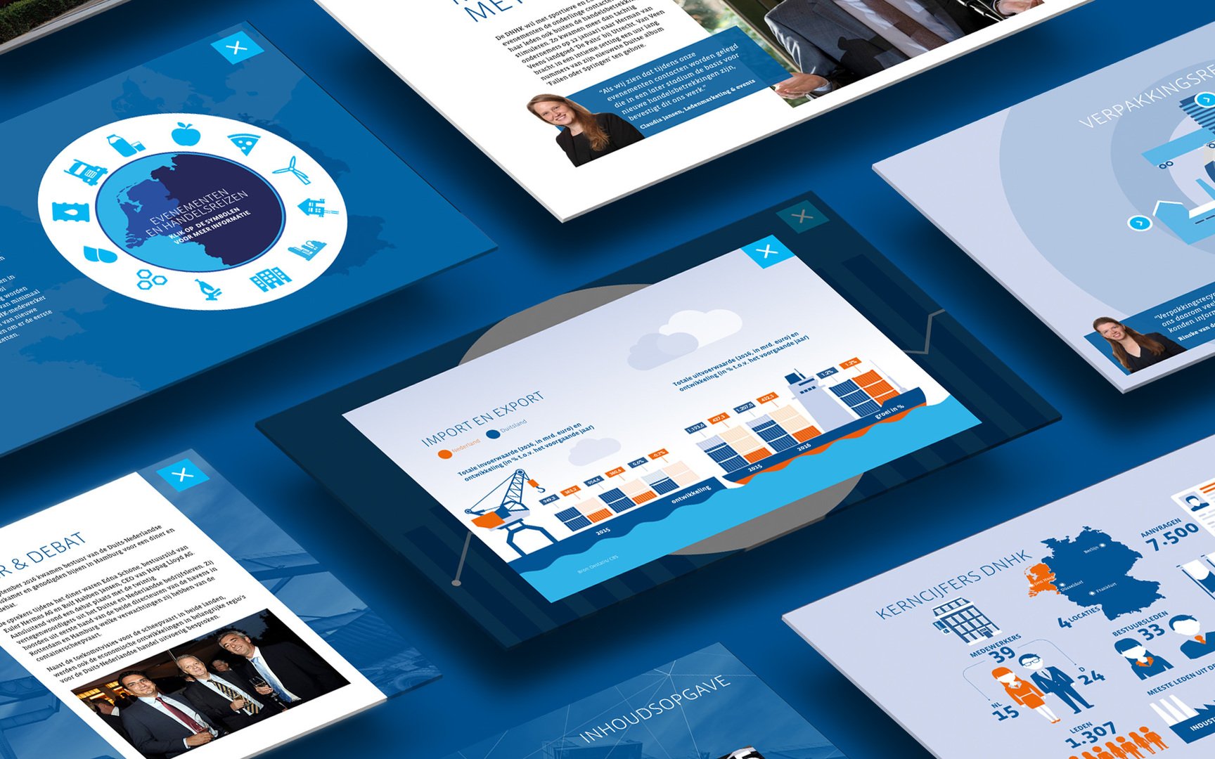
Marketers and designers now have a tool to create digital publications that are measurable and responsive in design. The platform provides a solution to upgrade all types of content that are living in and around websites:
* digital magazines
* sales presentations
* white papers
* annual reports
* landing pages
* campaign microsites
* product brochures
* embedded content
…and many more
Two editors, endless possibilities
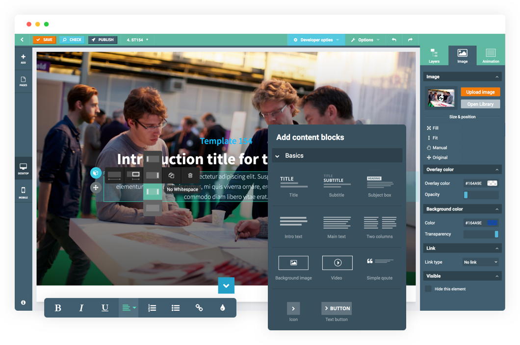
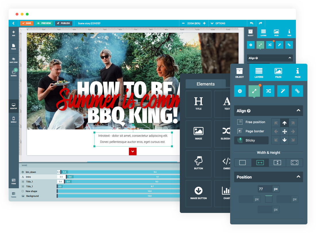
Maglr has created two types of content editors: a drag-and-drop Block editor and advanced Pro editor. Both editors come with a set of ready-to-use responsive templates. Create stunning content, without having to write a single line of code.
The Block editor is designed for marketers who want to release their inner content creator. Set up the corporate colors & fonts, choose a template and start adding and adjusting the predefined blocks to create your story.
The Pro editor is designed for professional designers who want to create content without boundaries. Start with a blank canvas and add layering and interactive elements such as animation, embedded media and scroll effects.
* Easy for the marketeer, extensive options for the designer. No technical knowledge required.
* Large library 150+ ready-to-use responsive templates
* Pro editor offers all the extensive options for the graphic designer
* Add text, buttons, images, video, slideshows, embeds and audio
* Pro – Make use of layering, groups and interaction between elements
* Pro – Animation options based on timing, scroll and mouse movement
* Pro – Extensive custom keyframe animations
* Pro – Divide your story into pop-ups or in vertically animated scenes
* Make specific adjustments for the mobile view
* Create a single article or complete publication
*Share your article via social media or embed within your own website
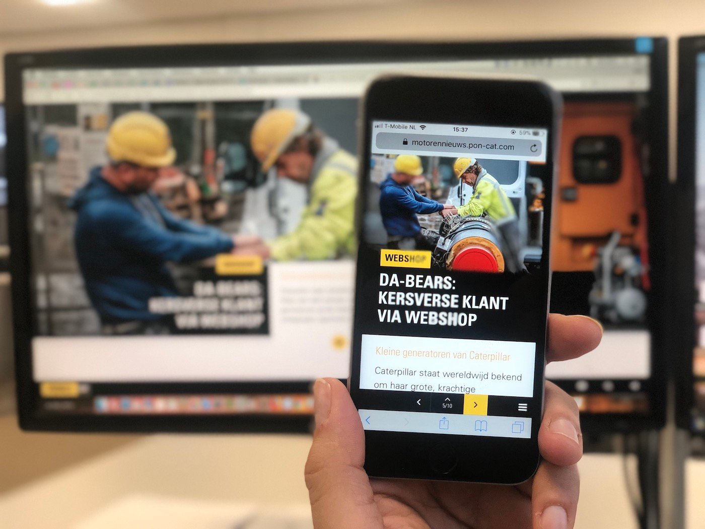
* Published result visible on multiple screen sizes


