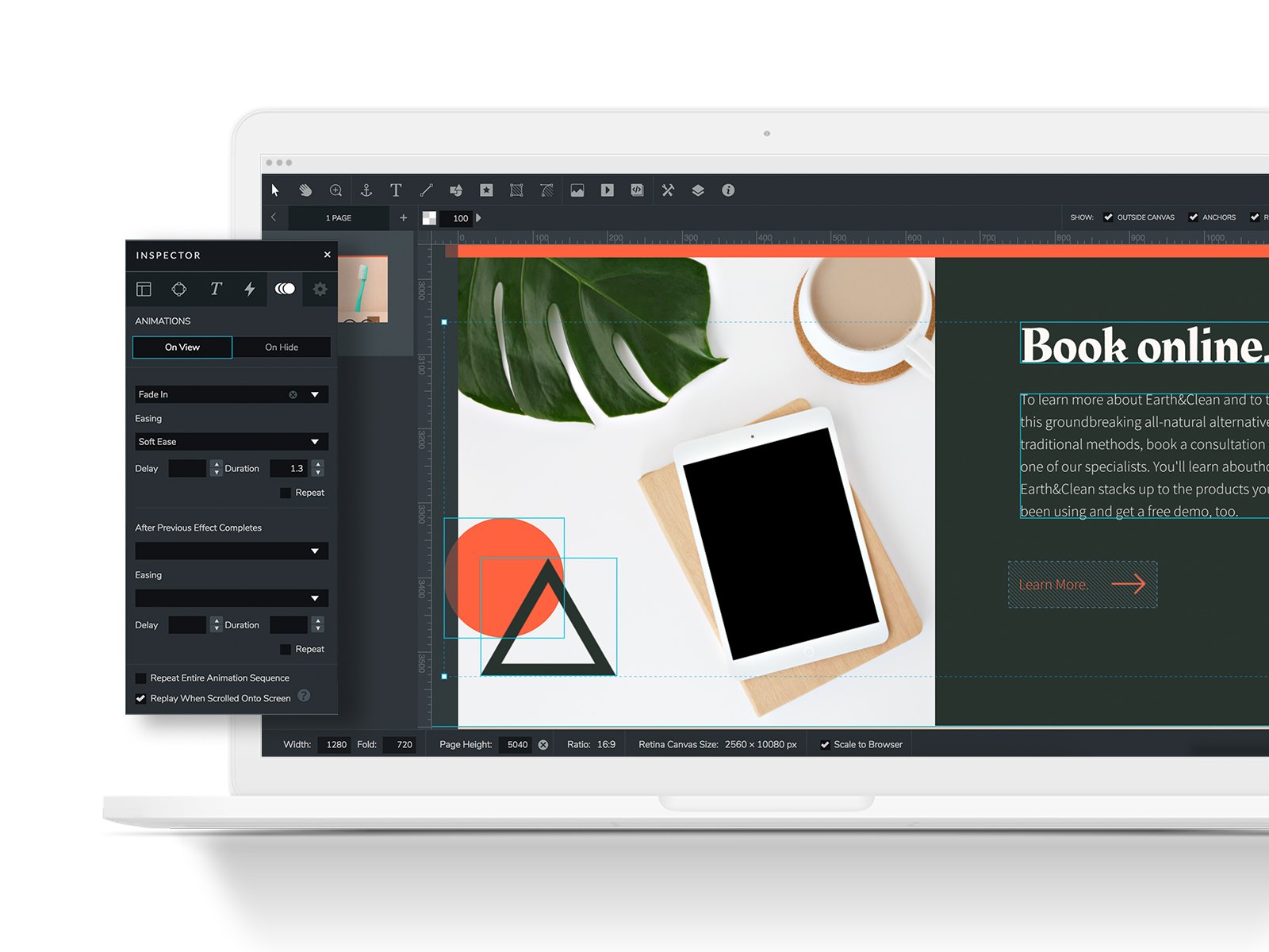
Markets themselves as an Adobe equivalent...but I'm not so sure about that.
What do you like best?
Ceros' customer service was great at responding to me quickly and, for the most part, with helpful responses.
What do you dislike?
Just about everything else, unfortunately. The idea behind the software is genius, but Ceros needs to prioritize what their customers are asking for and understand basic needs of users before continuing to sell without prefacing that there are so many flaws.
Recommendations to others considering the product:
While the benefits are there, they're hidden very well behind a steep learning curve, a sales team lacking in organization and understanding of the user end of the product, resources that aren't given unless the client asks for them, and many, many more unfortunate issues that arose in my short time working with Ceros. There's a ridiculous amount of potential with this product, but they definitely have a long way to go.
For example, there is no offline editing mode, meaning that, unless you are connected to the internet, you cannot design. As a designer myself, I know that I'll get some of my best ideas quickly and unexpectedly, and Ceros does not (and has admitted that in no time in the near future will they) align for that offline experience.
Ceros never remembers login information. Closing a window means logging you out, refreshing a window after a short period of time means logging out, and closing the browser means logging you out. It's not the worst thing on this list, but it is horrendously inconvenient.
When your design is published, Ceros has admitted that it is impossible for those viewing your project to zoom in or out of your project on mobile or desktop, making it out of the question for those with visual impairments to have even the slightest chance at viewing your creation.
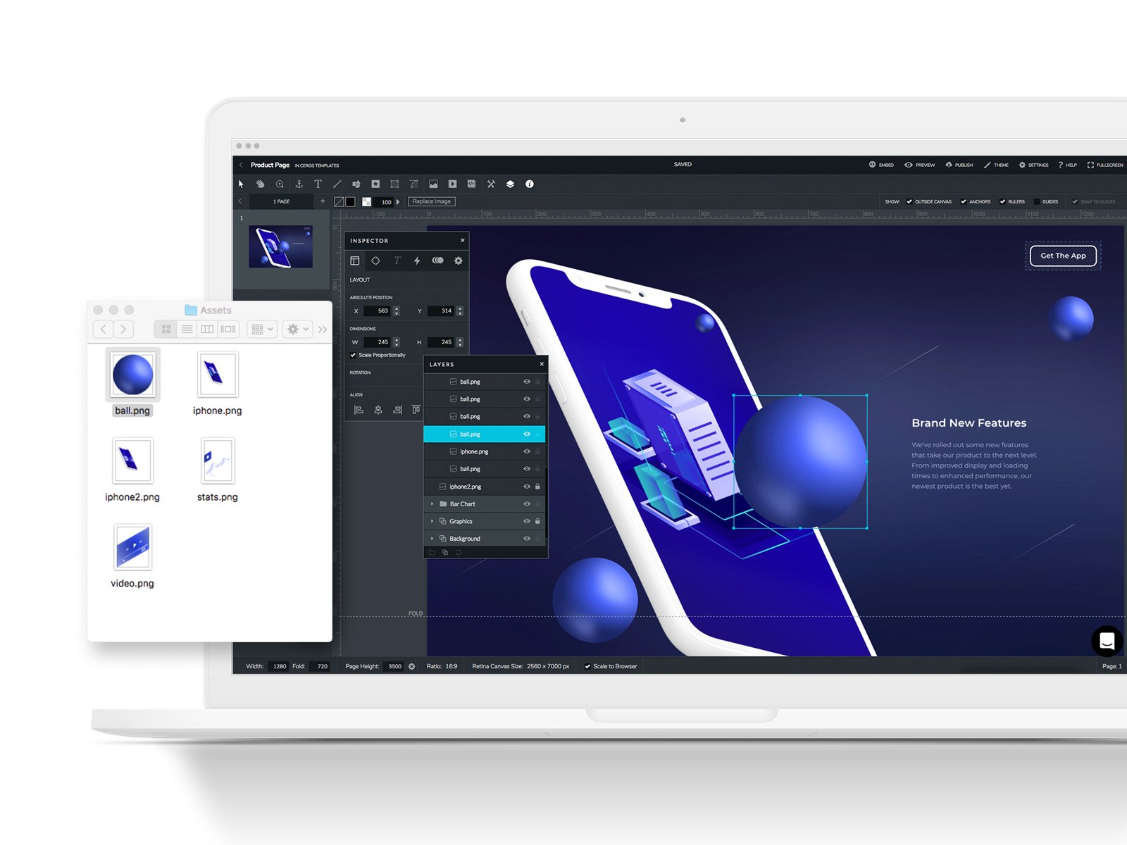
It is impossible to hyperlink - any piece of text you'd like to link to must be done with a "hotspot", an additional element that must be placed like a mask in a layer over the element you'd like users to click through, instead of simply being able to link something as you would, well, anywhere else.
On the page, there are no default templated menu options for people to get to certain sections. Instead, a menu must be created completely from scratch with individual text boxes, rectangular shapes, and hotspots that act as jumplinks to bring users down, all grouped together and pinned to the top of the page.
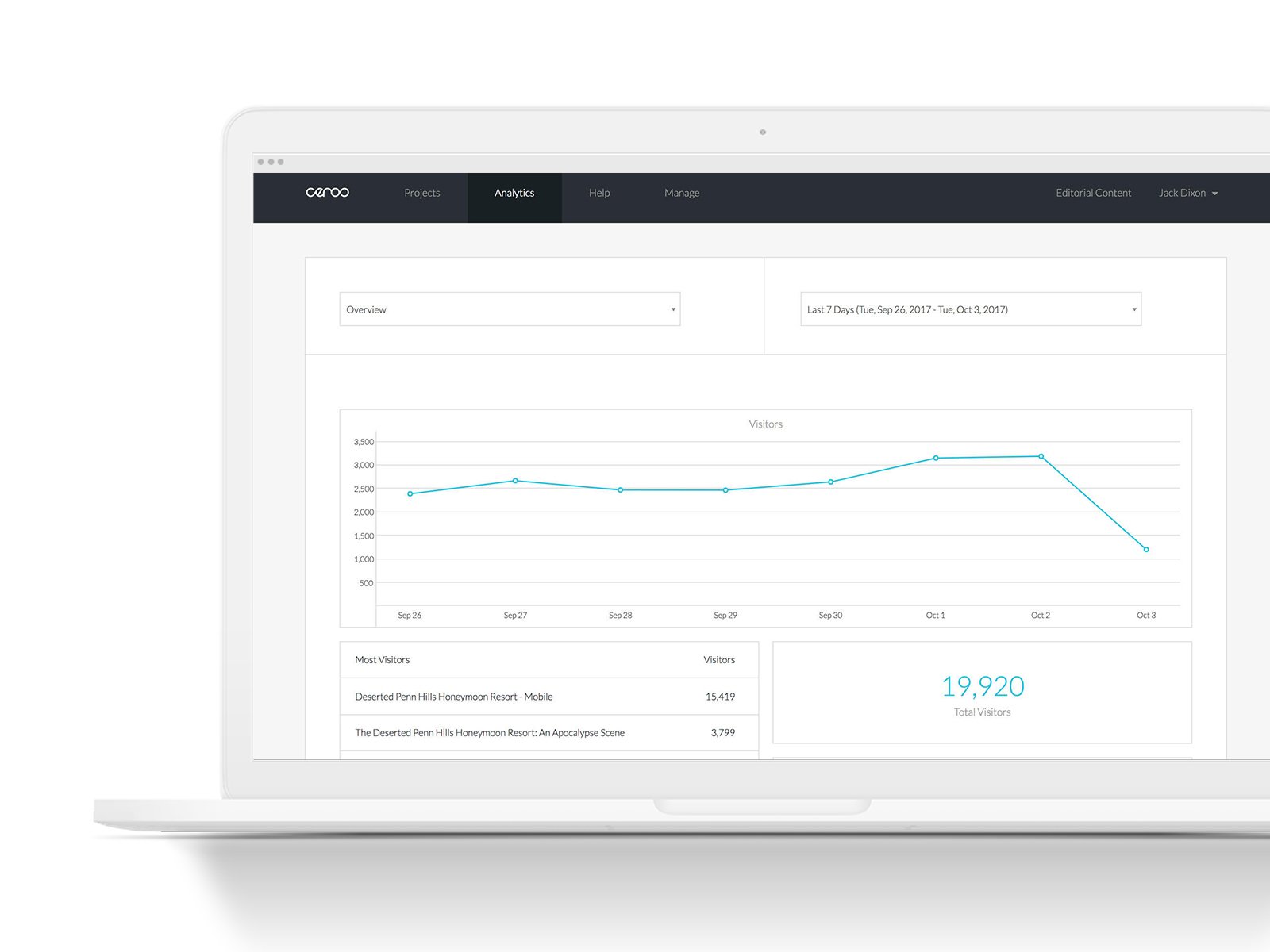
There is no data visualization tool within Ceros. Ceros suggested I use their Chartblocks integration, which was difficult to use, would not allow me to sign in, and had four font options. Four. Instead, I was told that if I did not want to use their integration, I would have to create everything by hand – incredibly tedious and disappointing.
I could go on, but I'll save readers time by saying that unless the design you're creating is simple, you have an enormous amount of patience, and don't mind constantly switching between Firefox, Chrome, and their desktop app, there just might be a better alternative out there for you.
What problems are you solving with the product? What benefits have you realized?
We used Ceros to create an interactive data visualization page for our readers to better understand and work with the original data we collected for an event. With Ceros, there are quite a few benefits in comparison to stagnant design, such as being able to present more information in a seemingly smaller place.


